So you’ve done all this work to drive traffic to your website why would you want to give people a reason to leave your website straight away? This is what you’re doing if you take no care in where you place your social media icons or care about what you put on social media.
Where should you place social media links?
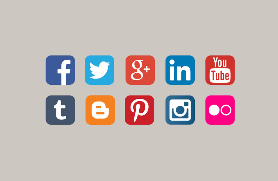
Some people argue that social media is too important to place in small icons at the bottom of a page, that sometimes they’re just too small they might as well just not be there at all. We agree that social media icons should be eye-catching and easy to find but we think that social media is better used to drive towards a site than off a site. Think about it. Your website is usually the place you’re using to sell your product to people, why would you want to draw people away from what you are selling? Placing social media icons at the top of the page is just inviting potential customers away from buying. Depending on how you’ve set up your business, often a good way to attract people to your website is through social media and not the other way around! Social media links such as twitter, facebook and Instagram are better off in the sidebar or the footer of a website. That way they’re not in your face whilst you are trying to buy or read something.
Share buttons
Share buttons are a great way to attract users to engage with your content. Clicking the prompts share the current page to a social network without being too big and obnoxious. Adding a share button to your page allows users to take full advantage of the unique functions, you can now share quotes directly to facebook and twitter.
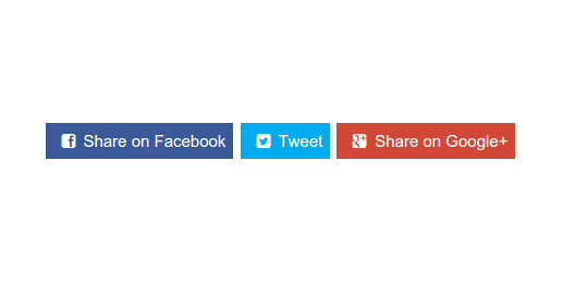
By building a quick share or a quote feature on your website you are boosting social interactions by creating a quick click CTA for users. CTA stands for Call – To – Action and it’s basically a link, a line of text or media source that prompts your website visitors to take action, this could be anything like buying something or in our case visiting our social media. Don’t be afraid to use share buttons that are less commonly used. Websites that are specifically for design or are creative tend to use Pinterest and Instagram share links whereas more business type sites may use google plus or even email share links but branch out, use more, find creative ways of firstly bringing people to your site but also taking people to your social media!
Social media must be tailored to your website
Your social media accounts (for example you may use Instagram, facebook and twitter) believe it or not all have different audiences. A post that does well on Facebook won’t always do well on Instagram and Twitter, and vice versa. You need to tailor your posts towards each audience on each platform to gain the best engagements. Your website is the final destination, the place where you want potential customers and buyers to end up, this is the place where the audiences from each platform come together as one so if each post is different on each platform you obviously need to make sure they are still relatable to the website or product that you are selling. You can try different types of posts and different times of uploading across each site and find out which times and which kind of posts get the best engagement for each platform. You can then use this to your advantage to try to maximize the reach each post gets.
For more tips and tricks on web design and social media follow our Instagram – https://www.instagram.com/unit36uk/ we post a tip every other day!
